
PTE Describe Image practice tasks form a very powerful part of the speaking module of PTE Academic. It measures your speaking abilities in addition to your skill to assume on your feet.
Describe Image process contributes only for your PTE speaking ranking (speaking, pronunciation and oral fluency).
You might get bar graphs, line graphs, pie charts, diagrams, photographs, or maps to describe. Once an image appears on the screen, you are allocated 25 seconds to study it. Then, after
25 seconds, the microphone opens for 40 seconds.
There are Seven different types of images that typically appear in the exam:
- Bar Graph
- Line Graph
- Pie Chart
- Table
- Process Diagram
- Map
- Venn Diagram
Take a look at the following PTE Describe Image Practice Template to score better in this task:
Describe image Question 1


Requires active subscription!
Sample Speaking: This horizontal/vertical bar graph depicts the information referring to households with access of the internet. The data is presented/calibrated in percentages. It’s crystal clear from the graph that 2020 has the highest percentage, at 70%, while 2017 has the lowest, roughly 60. Apart from that, 2018 and 2019 have almost equivalent percentages, roughly 60. In conclusion/Overall, it may be noticed that a gradual increase was there from the year 2017 to 2020.
Describe image Question 2

Requires active subscription!
Sample Speaking: The given image shows several trends and features. Looking closely at the image, I can deduce that the image contains different shapes, colors, texts, and numbers. Basically, a thorough analysis of the picture reveals a lot of detail. The image displays various things such as invest, sales, and profit. Similarly, Year 1, Year 2, and Year 3 can be observed in the image. I can notice 4.3, 2.4, and 2. However, the illustration also highlights 3.5, 3.8, and 4.5. In conclusion, the picture provides important information.
Describe image Question 3
Requires active subscription!
Sample Speaking: This line graph highlights the Dubai gold sale over a period of 2020 from Jan to Dec. The quantity used to be highest in March at 350 millions of dollars, and the quantity regularly declined, to reach a low of 100 million dollars in July. On the other hand, in July , the number of 100 million dollars used to be the lowest in 2020, and it gradually rose,peaking at 200 million dollars. In conclusion/Overall, it may be noticed that fluctuation was observed in the given data.
Describe image Question 4

Requires active subscription!
Sample Speaking: The graph shows the difference in wheat exports in three different areas.
The line graph of wheat experts shows a quite different pattern between 1985 and 1990. In 1985, Australia exported around 15 million tonnes of wheat and the following year the number seems to increase by one million tonnes to 16 million. After that, there was a gradual decline until 1989 and 1990, when they stabilized at about 11 million tonnes. Over the same period, the amount of Canadian exports varied greatly. It started at 19 million tonnes in 1985, reached a peak in 1988 of 24 million, dropped dramatically in 1989 to 14 million tonnes, and then climbed back to 19 million in 1990. Exports from Australia started declining over the five-year period, while the Canadian market fluctuated a lot, and the European Community showed an increase.
Describe image Question 5

Requires active subscription!
Sample Speaking:This graph is about the income distribution of China and the USA in 1970 and 2000. China is represented in pink and the USA is represented in green. In 1970, most the people in China had an income amount of $1000, while most of people in America had about $20,000 per year. The income distribution in America was more evenly distributed, while the population of China was much larger. In 2000, in contrast, most of people in China had an income of $5000 per year and the income distribution became more even. The income of the American people increased to $50,000. In conclusion, this graph gives very detailed information.
Describe image Question 6

Requires active subscription!
Sample Speaking: The slices of the pie chart illustrate the preferred mode of commuting. The data is presented in form of percentages. It’s crystal clear from the pie chart that the lion’s percentage of preferred modes of commuting is covered by the metro, followed by bike. On the other hand, the smallest part is covered/occupied by cars. In conclusion/Overall, it may be stated that the metro is the most preferred mode of commuting and the car is the least mode of
Describe image Question 7

Requires active subscription!
Sample Speaking: The chart shows the percentage of different modes of transportation used by people in Birmingham.The pie chart depicts the different types of transportation used by people in Birmingham city. People of Birmingham use public transport more as compared to their own vehicles. 38.9 percent of people use buses for daily commuting and 30.5 percent of people travel by train. Only 11.5 percent of people travel by their own cars. 19.1 percent of people travel by taxi in Birmingham city. Overall, buses are the preferred mode of transportation in Birmingham.
Describe image Question 8
Requires active subscription!
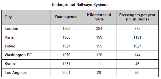
Sample Speaking: The table shows data on underground railways systems measure in millions of passengers in six metropolitan cities namely London, Paris, Tokyo, Washington DC, Kyoto and Los Angeles. The highest number of passengers were recorded at Tokyo railway system with 1927 passengers followed by 1191 passengers at Paris. The least number of passengers and route were found at Kyoto with 45 passengers and 11 kilometres respectively.
Describe image Question 9
Requires active subscription!
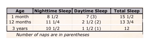
Sample Speaking: This table represents the information about sleep patterns for kids of ages 1 month, 12 months, and 3 years. A one-month-old baby sleeps almost an equal number of hours during the day and night. 12 months and 3-year-old baby get the majority of sleep during the night. In conclusion, the amount of total sleep required for a baby reduces as they get older, and the frequency of naps also reduces.
Describe image Question 10

Requires active subscription!
Sample Speaking: This image represents the process of production of a sleep hormone called Melatonin. When the human eye sees a candle light there is inhibition, and during darkness, there is stimulation of melatonin production. Melatonin is produced in the brain by the pineal gland, upon the stimulus from the eyes. The production and inhibition create the biological clock of the body. In conclusion, this shows how our body responds to light and darkness, and how the production of Melatonin depends on the light.
Describe image Question 11

Requires active subscription!
Sample Speaking: This image represents the manufacture and distribution of clay bricks.Firstly, the clay is dug out of the earth by a digger and sorted on a metal grid and roller. The clay is then mixed with sand and water and shaped in either a cutter or a mold, before being dried in a kiln. The kiln operates at different high temperatures, after which the bricks are cooled. Finally, the bricks are packaged and delivered to their destination. This brick-making and distribution process is a straightforward and effective way of manufacturing bricks for the building industry.
Describe image Question 12

Requires active subscription!
Sample Speaking: This image represents the countries on the world map that are potentially vulnerable to climate change. The least vulnerable countries are in North America and in Eastern Europe, while less vulnerable countries include Russia, Australia, Mexico, and South Africa. The countries in the intermediate range contain south American countries and a few countries in the African continent. The vulnerable countries include China and Pakistan while the most vulnerable countries are India, south Asian countries, and a few African countries. In conclusion, developing countries are the most affected, while developing countries are the least affected.
Describe image Question 13

Requires active subscription!
Sample Speaking: Well here we are at the top of the town and we gonna look at the view from each direction. Out to the east, large buildings about a kilometer away from the Olympic site, there an indoor arena for gymnastics, a swimming pool for swimming, and a Stadium (track and field). If you look carefully down there, you can see the train line. The Olympic site has a station to encourage the use of public transport. If you look at the south, you can see a circular ornamental pond, and around the west, you can relax and sit on the bench to smell the flowers in the rose garden. Finally up to the north, if you look in front of you now, there is a lake with a small island in the center and a boat in North-West.
Describe image Question 14
Requires active subscription!
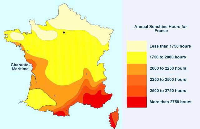
The map shows the annual sunshine hours for France. According to the map, there are six ranges of hours are recorded, which are from less than 1750 hours to more than 2750 hours. It is clear that the sunshine hours decrease from north to south, and the south part of the France has the most sunshine hours which are more than 2750 hours per year. Furthermore, Charante Martimein is the only place in the middle part of the France which the annual sunshine hours are over 2250. In conclusion, the map provides detailed status of annual sunshine hours for France.
Describe image Question 15
Requires active subscription!
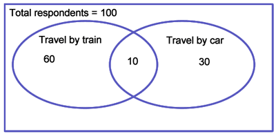
Sample Speaking: This diagram shows how a selection of 100 second-year university students traveled to university. 60 students said that they traveled by train, 30 stated that they traveled by car, and 10 students stated that they traveled by both car and train. One could conclude that most respondents traveled to the university by train, a minority traveled only by car, while a small number of the respondents, 10%, traveled by both train and car.
Describe image Question 16

Requires active subscription!
Sample Speaking: As you can see now that you have had a go at this section it’s not about how complicated you can make the description sound, but about being clear,precise, and accurate you come across to the listener. Go back and listen to your recording and ask yourself if you were clear, if you articulated your ideas effectively, and if you pronounced the keywords well. Below the question, there is a sample answer. It’s always a good idea to go through and listen to the sample answers to get an idea of what the ‘perfect’ answer sounds like. Listen to your answer and then listen to the sample answer and make notes on what was lacking or unnecessary in your answer to help you make the best self-assessment. All the information is there in front of you, you just need to make sense of it. Practice makes perfect and that’s what you are here to do. So don’t worry if you didn’t smash it the first time, you’ll soon get the hang of it.
Describe image Question 17
Requires active subscription!
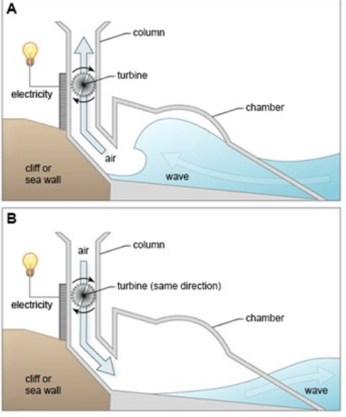
Sample Speaking: The diagram shows the structure that is used to generate electricity from wave power. Two diagrams show how electricity is generated from the rise and fall of water caused by sea waves. The process involves a structure that is mounted on the side of a cliff or a sea wall. This structure consists of a large chamber. One end is open to the sea and the other leaders into a vertical column which is open to the atmosphere. The first diagram indicates that the moment when the wave approaches the device, water is forced into chamber, applying pressure within the column. The second one depicts the waves retreating. As a result, electricity continues to be generated. The turbine rotates only in one direction, regardless of the direction of air flow.
Describe image Question 18

Requires active subscription!
Sample Speaking: The picture shows us the structure of lower mantle. As we can see from the picture, the earth has the layers of lithosphere, mantle and core. Specifically, lithosphere consists of crust and uppermost solid mantle, and the mantle consists of lower mantle and asthenosphere. In addition, there are two layers of core which are solid core and liquid core. In conclusion, lower mantle is the middle layer of the earth.
Describe image Question 19

Requires active subscription!
Sample Speaking: Flowchart illustrates the production of colored plastic paper clips in a small factory. There are four main stages in the production of plastic paper clips from a small factory. Two of these stages involve actual preparation of the clips, while the other two consists of quality control before the clips are sent out from the factory to the retailers to be sold to the public. Molten plastic is poured into three different molds which depends on the color required. Once these clips emerge from the molds a quality control machine checks them for the street. Then clips are stored by hands into two groups, mixed and single colors. After that color mixtures are divided correctly into single colors and mixed color batches. Finally, the clips are packed and dispatched to markets.
Describe image Question 20

Requires active subscription!
Sample Speaking: The following graph gives information about the Leaning Tower of Pisa. In the central area, there is the White Tower, which is a eight -story building. In the left area, there is an ancient old building with a lot of pillars. According to this graph, the ground is a green lawn under the tower. In comparison, the background is a blue and sunny sky. In conclusion, this is a famous resort in Italy.
Describe image Question 21

Requires active subscription!
Sample Speaking: The image illustrates the impact of limiting social contacts on the transmission of the coronavirus. The top half shows a scenario without restrictions, where one infected individual leads to a wide and expanding chain of transmission, infecting numerous others. The bottom half demonstrates a scenario with limited social contacts, significantly reducing the spread of the virus. Key points are highlighted where potential transmissions are avoided due to these measures, visibly showing fewer infected individuals. This visual emphasizes the effectiveness of social distancing in controlling the spread of the virus.
Describe image Question 22
Requires active subscription!
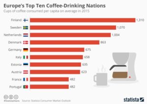
Sample Speaking: This bar chart displays Europe’s top ten coffee-drinking nations based on cups of coffee consumed per capita in 2015. In general, coffee consumption varies significantly between the countries. Finland leads significantly with 1,310 cups per person, followed by Sweden at 1,070, and the Netherlands with 1,004 cups. Denmark and Germany consume 863 and 675 cups respectively, showing moderate consumption. Italy, known for its coffee culture, surprisingly consumed just 658 cups. Estonia, Austria, France, and Portugal also make the list, each consuming between 482 and 635 cups per capita.
Describe image Question 23

Requires active subscription!
Sample Speaking: This line graph illustrates the percentage of the world’s population living under democratic governments from 1816 to 2015. In 1816, only 1% of humanity lived in democracies. The share remained relatively low until a noticeable increase starting around 1900. Significant growth in global democracy began around 1950 and continued to rise sharply through the late 20th century. The trend reached its peak in 2015, with 56% of the global population living in democratic nations. The chart highlights major gains in democracy post-World War II and through the end of the Cold War.
Describe image Question 24
Requires active subscription!
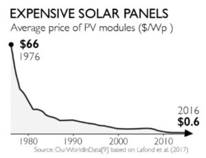
Sample Speaking: The graph illustrates the significant decrease in the average price of PV modules from 1976 to 2016. In 1976, the price was $66 per watt. Over the next 40 years, the cost dramatically dropped, showing a steep decline especially from the 1976 and 1980. After that, the decline is more steady. By 2016, the price had decreased to just $0.6 per watt. This trend reflects substantial advancements in solar technology and increased manufacturing efficiency, making solar energy much more accessible and affordable over the decades.
Describe image Question 25

Requires active subscription!
Sample Speaking: This pie chart displays the most-owned laptop brands in South Africa as of June 2023, based on a MyBroadband poll. Dell leads with 22.7% ownership, followed closely by HP at 19.5%. Lenovo holds 17.6%, and Apple has 14.3%. Asus and Acer have smaller shares at 9.2% and 6.8% respectively. The category labeled “Other” accounts for 9.9% of laptop ownership. Overall, the data indicates that there is not one dominant laptop brand in South Africa.
Describe image Question 26

Requires active subscription!
Sample Speaking: This bar chart illustrates the major refugee-hosting countries as of the end of 2014. Turkey leads with the highest number of refugees, followed by Pakistan and Lebanon. These top three countries collectively host 30% of the world’s refugees. The next two countries, the Islamic Republic of Iran and Ethiopia, bring the total hosted by the top five countries to 41%. The inclusion of Jordan, Kenya, Chad, Uganda, and China rounds out the top ten, which together accommodate 57% of the global refugee population, as reported by UNHCR.
Describe image Question 27

Requires active subscription!
Sample Speaking: This image shows a line graph depicting gun deaths among U.S. children and teens under 18 from 1999 to 2021. The number of deaths decreased from 1,776 in 1999 to a low of 1,258 in 2013. After that, the numbers started to rise, reaching 1,732 in 2019 and 2,590 in 2021, a rise of 50% in just 2 years. This is a worrying trend that calls for a forceful response.
Describe image Question 28

Requires active subscription!
Sample Speaking: This pie chart from the Pew Research Center presents data from a survey conducted in January 2024, detailing how U.S. adults have adhered to their New Year’s resolutions. Among respondents who made at least one resolution, 59% reported that they have kept all of their resolutions, while 28% have kept some of them. Conversely, 13% admitted to not keeping any of their resolutions. This data illustrates a relatively high rate of commitment to New Year’s resolutions among the surveyed group.
Describe image Question 29

Requires active subscription!
Sample Speaking: This line graph presents the amount of oil spilled from tanker ships in thousands of tons, spanning from sometime before 1980 to 2016. The graph shows a dramatic peak in 1979 with 636,000 tons spilled, marking the highest point of oil spills. Following this peak, there are several significant spikes, particularly noticeable through the 1980s. From the 1990s onward, the frequency and volume of oil spills sharply decline, reaching a low of just 6,000 tons in 2016, indicating a substantial reduction in major oil spills from tanker ships over the decades.
Describe image Question 30
Requires active subscription!
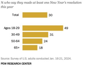
Sample Speaking: This bar chart from the Pew Research Center displays the percentage of U.S. adults who made at least one New Year’s resolution in January 2024. Overall, 30% of adults made a resolution. The data is broken down by age groups, showing that younger adults (ages 18-29) are the most likely to make resolutions, with 49% doing so. This rate decreases with age: 31% of adults aged 30-49, 24% of those aged 50-64, and only 18% of those aged 65 and older made resolutions.
Describe image Question 31

Requires active subscription!
Sample Speaking: This line graph illustrates the decline in the number of countries where forced labor is legal or practiced by the state from 1800 to 2017. In 1800, 194 out of 195 countries legally or officially practiced forced labor. Over time, this number gradually decreased, showing a significant decline particularly in the 20th century, and reaching a low of 3 countries by 2017. This demonstrates a substantial global reduction in the acceptance and practice of state-sanctioned forced labor over the past two centuries.
Describe image Question 32

Requires active subscription!
Sample Speaking: This line graph illustrates the decline in the number of countries with smallpox cases out of 194 total countries from 1850 to 1979. In 1850, 148 countries reported smallpox cases. The number of affected countries gradually decreased over the years, with a more significant decline starting around 1950. By 1979, smallpox was eradicated, with zero countries reporting cases. This timeline highlights the successful global efforts to eliminate smallpox.
Describe image Question 33
Requires active subscription!
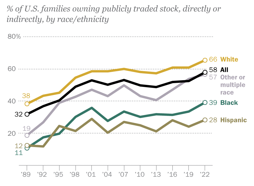
Sample Speaking: This image shows a line graph with multiple data series, depicting the percentage of U.S. families owning publicly traded stock, directly or indirectly, from 1989 to 2022, broken down by race/ethnicity. The ownership rates for White families rose from 38% in 1989 to 66% in 2022, consistently higher than other groups in every year in the chart. Black families saw an increase from 11% to 39%, while Hispanic families grew from 12% to 28%. Families of other or multiple races started at 32% and ended at 57%. The overall ownership percentage for all U.S. families rose from 32% to 58% over the same period. Overall, the chart makes clear the racial/ethnic disparities in family wealth in the United States.
Describe image Question 34

Requires active subscription!
Sample Speaking:
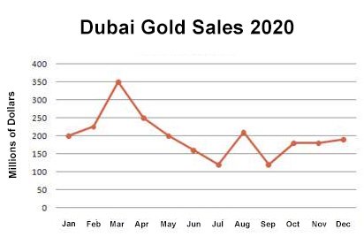
This line graph or chart indicates Dubai Gold Sales in 2002 throughout the year measured in millions of dirhams.
In January, the price was at 200 dirhams. It saw a sharp rise from February, reaching 350 million. Additionally, there was a sharp decline, followed by a slower decrease, ultimately resolving at 150 million in July. As we see, August marked a brief recovery, with sales hitting 200 million, followed by another decline in September. However, by December, sales again returned to 200 million.
In conclusion, in the whole year, there were changes, but on the whole, sales remained at approximately 200 million dirhams per month.
Describe image Question 35
Requires active subscription!
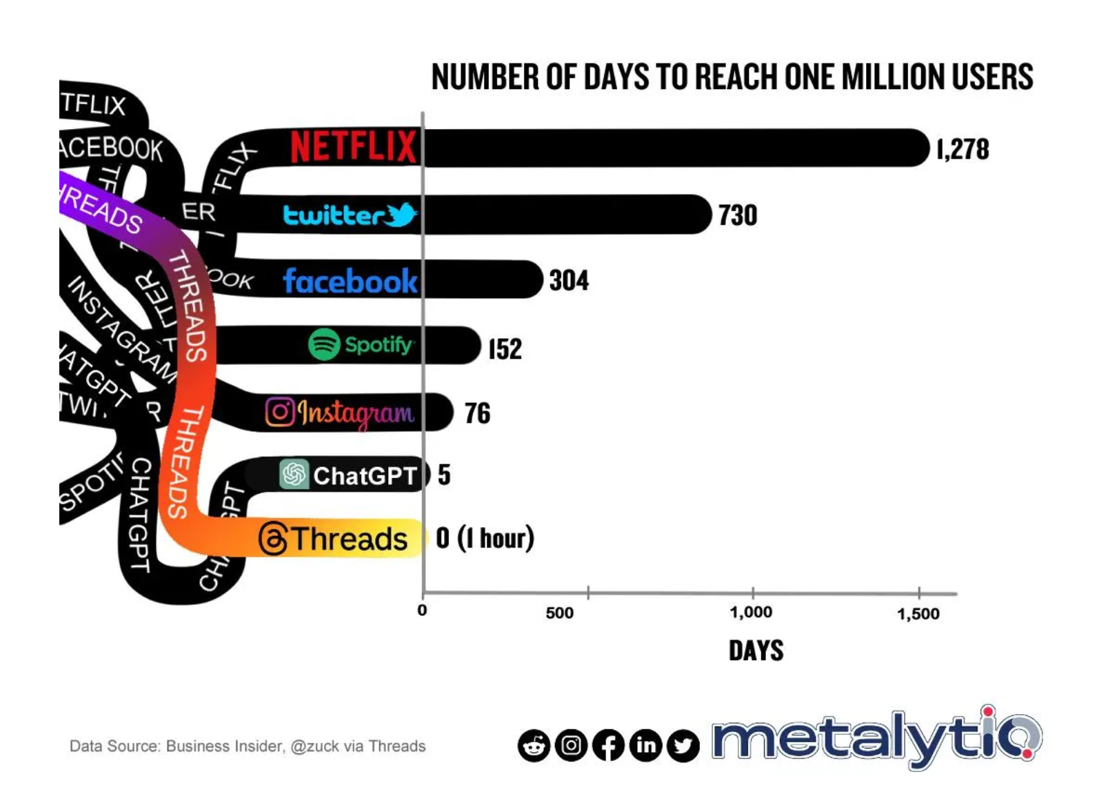
Sample Speaking: This bar graph displays the number of days it took various platforms to reach one million users. Netflix took the longest at 1,278 days, followed by Twitter with 730 days, and Facebook with 304 days. Spotify reached the milestone in 152 days, while Instagram did so in 76 days. ChatGPT achieved one million users in just 5 days. The most rapid growth was seen with Threads, which reached one million users in 0 days, essentially within one hour. The data highlights the accelerating pace at which new platforms can gain significant user bases.
Describe image Question 36
Requires active subscription!
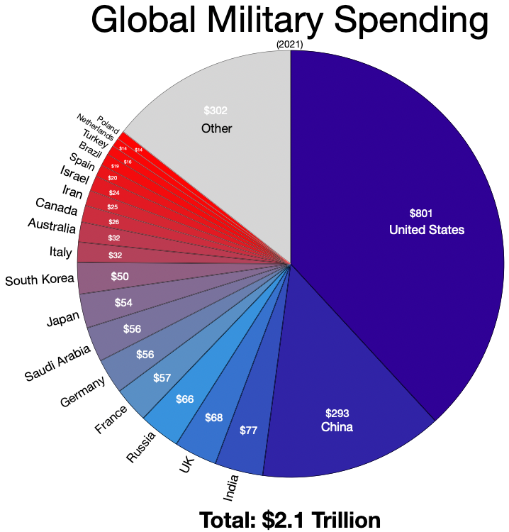
Sample Speaking: This pie chart details global military spending for the year 2021, totaling $2.1 trillion. The United States leads with a significant portion, spending $801 billion, which is far more than any other country. China follows with $293 billion. Other major contributors include India ($77 billion), the UK ($68 billion), Russia ($66 billion), and France ($57 billion). Countries like Saudi Arabia, Japan, Germany, and South Korea also feature, each spending between $50 and $57 billion. The segment labeled “Other” sums up $302 billion, accounting for the combined spending of numerous other countries. This visualization underscores the substantial disparity in military expenditures between the U.S. and the rest of the world.
Describe image Question 37

Requires active subscription!
Sample Speaking: The process chart outlines the procedure for generating household electricity using solar panels. When solar panels are placed on a house’s roof, they capture the solar energy and convert it into DC. After that, an inverter plays an important role in transforming this DC into an AC current, managing electricity production, and giving out it throughout the entire home. Finally, in cases where the electricity generated by the solar panels falls short, the utility grid steps in to supply the extra power that is needed.
Describe image Question 38

Requires active subscription!
Sample Speaking: The process chart represents the four continuous steps that are involved in the process of recycling unwanted or used products. In the first step, manufacturers distribute the goods to the retailers from where the consumers purchase them. After completing the utilization of the product, the remaining waste is handed over to the recyclers. In the end, recyclers reproduce the raw materials to manufacturers. Overall, the art of converting waste into material can contribute to an eco-friendly environment.
Describe image Question 39

Requires active subscription!
Sample Speaking: The chart shows that 72% of the people preferred their vehicles, followed by 17% who chose to walk to reach their chosen destination. Public transportation like trains buses, and ferries was used by 10% of individuals, and only 2% of people chose other forms of transportation.
Overall, we can conclude from the chart that people in Sydney find much more comfort in traveling in their vehicles for trips as compared to other conveyances.
Describe image Question 40

Requires active subscription!
Sample Speaking: The image shows the information about a lecture hall. According to the image the seating arrangement is well designed so that every member of the audience should be able to see clearly at all times with an unobstructed sight line, lecturer stage is in the middle of the lecture hall, equipped with whiteboard and podium. Moreover, after analyzing the main key aspects, it can be concluded that this image shows crucial information about the interior design of a lecture hall, which is strongly supported by data and facts.
Describe image Question 41

Requires active subscription!
Sample Speaking: This image represents the structure and function of various parts of a bike. It basically has two wheels made up of spokes to share riders weight evenly. The front wheel is attached to the handlebar, which makes the wheels easier to turn. The back wheel has gears linked by a chain that increases speed. The chain is connected to a pedal that cranks and increase pedalling force. There is a horizontal bar at the top of the frame that divides riders weight evenly between wheels. In conclusion, this structure looks simple but it’s a very efficient means of transport.
Describe image Question 42

Requires active subscription!
Sample Speaking: The given flow chart portrays the Enquiry Process and Terms of Reference for Australia in 2015. This process begins with the Terms of Reference and ends with the Government’s response. Eventually, it involves opening research and consultations, followed by the forming of an issue paper and a call for submissions. Afterwards, there is an examination of the received submissions, leading to the evolution of a Discussion Paper. After seeing the discussion paper and further consultations, a final report is made. Then, this report is submitted to the government, which will result in a response involving potential legislative changes.
Describe image Question 43

Requires active subscription!
Sample Speaking: This line graph shows the projected births in Australia from 2011 to 2101. The highest numbers of projected births are in 2101 whereas the lowest are in 2011. Projections for Series C remain relatively steady throughout the period while Series B shows double the number of births by 2101. Series A has the highest increase, with a jump of over four hundred thousand births per year. It could be predicted that birth rates will continue to climb after 2101, though the increase for Series C is likely to be quite modest.
Describe image Question 44

Requires active subscription!
Sample Speaking:
The given image shows a young girl who is crossing the road and seems like she is busy on her phone.
The highlight of the image is what I can observe is that she is not aware of anything and busy looking at her phone while crossing the road. There is no other person around her that’s why she can cross the road very smoothly. In the background, I can only see some cars and trees.
Overall, I can conclude from the image that the person knows her destination and where she has to go after crossing the road.
Describe image Question 45

Requires active subscription!
Sample Speaking: The image shows information about the food waste thrown in the dustbin. There are various types of food products thrown in the dustbin. They are dry roasted fish and pizza leftover, the peal of fruits, thick sticks of coriander, leftover dry veggies, and noodles. If we count the number of the items highlighted in the image, then there are 14 items. Out of which, a few are dry waste, whereas, some are wet waste. Overall, the food thrown should be preferably dry.
Describe image Question 46
Requires active subscription!
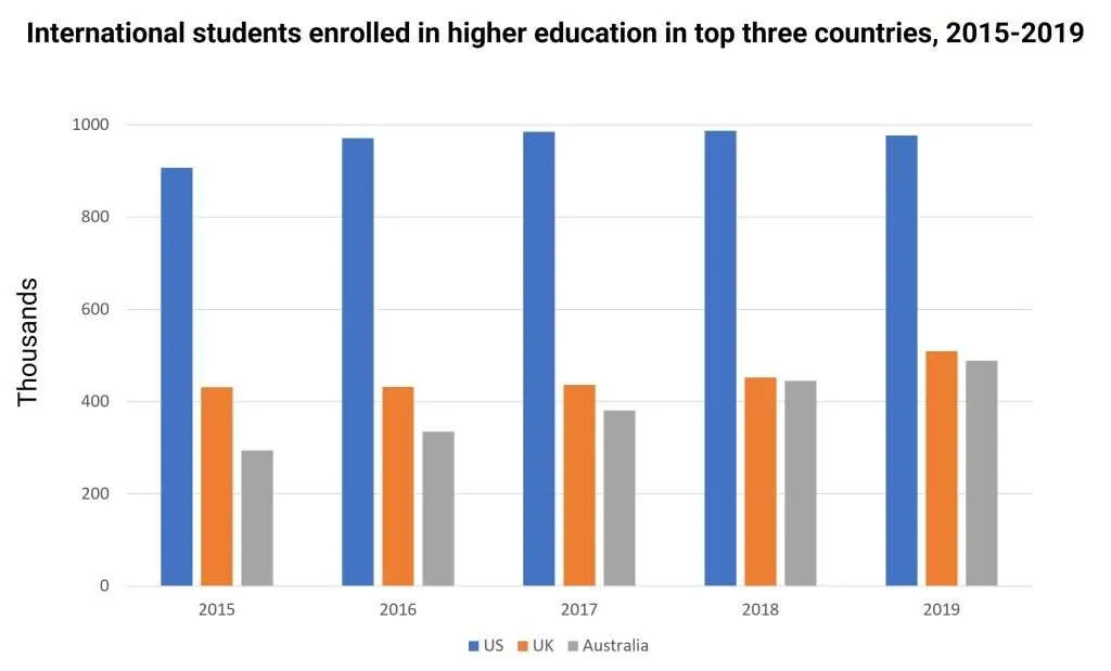
Sample Speaking: The bar chart compares international student enrollments in higher education in the US, UK, and Australia from 2015 to 2019. The US consistently leads with around 900,000 students yearly. The UK remains steady between 400,000-500,000 students. Australia shows a gradual increase, reaching UK levels by 2019. Overall, the US dominates, while Australia catches up with the UK over time.
Describe image Question 47
Requires active subscription!
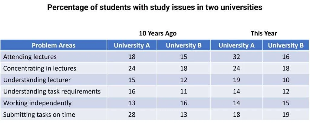
Sample Speaking: The number of students with problems attending lectures rose drastically from 18 to 32% in University A, whereas it remained at 15 to 16% in Univeristy B. University A saw a reduction in the number of students having issues with submitting tasks on time, from 28 to 18%, while this increased from 13 to 19% for University B. Finally, University A had 24% of students with problems concentrating in lectures, compared with 18% in University B, and this did not change over time.In conclusion, the two universities had notable differences in study-related challenges, with some improving over the last decade while others worsened.
Describe image Question 48
Requires active subscription!
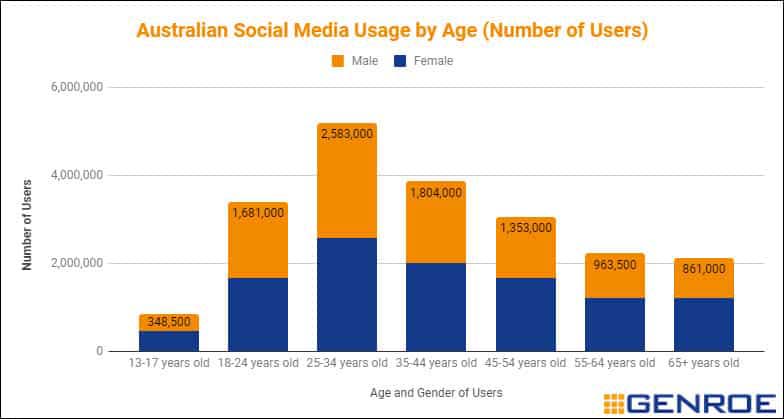
Sample Speaking: The bar graph showcases the Social Media usage in Australia by age and gender. It can be discerned that the age group of 25-34 years spend the most time on social media with the number of users being 2,583,000.Teenagers and old people clearly are the ones spending the least amount of time on social sites with the numbers 248,500 and 861,000 respectively. Interestingly, there is not a huge difference between the genders when it comes to accessing social media. I can however see that among teenagers and old age people, more females spend time on social media compared to their male counterparts. Overall, I can conclude that this graph illustrates crucial information and justifies that people in Australia spend considerable time on social media.
Describe image Question 49
Requires active subscription!
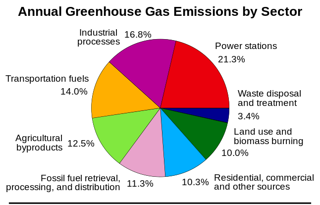
Sample Speaking:The pie chart reveals the annual greenhouse gas emissions by different sectors. Upon observing the chart, I can deduce that power stations have the largest share of emitting greenhouse gas, 21.3%, than any other sector . Similarly, industrial processes and transportation fuels also contribute heavily with the figures of 16.8% and 14.0 % respectively, to greenhouse emissions. Interestingly, agriculture by products too generate a sizable share of 12.5%. Waste disposal and treatment has the least share of 3.4% in the emissions. In conclusion, I can say that the figure above provides vital information regarding the contributors of greenhouse gas emissions.
Describe image Question 50

Requires active subscription!
Sample Speaking:The line chart gives projects the information regarding the increase in the cyber crime in India in the past decade. Based on my observations of the chart from 2010 to 2018, I can see a great variation in the figures. The crime rate increased sharply from 2016 and peaked at 27,248 cases in 2018. Before that there had been a steady increase from 966 cases in 2010 to around 12,000 cases in 2016. I can locate an incline from 2013. It can be clearly stated that never was there a decline in the number of cyber crime cases. Consequently, I can conclude that the data shown is pivotal in providing information regarding the exponential increase of cyber crime in India.
Describe image Question 51
Requires active subscription!
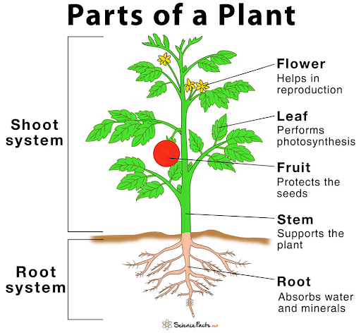
Sample Speaking: The diagram depicts the parts of a plant, categorized into the shoot system and root system. The shoot system includes the flower, leaf, fruit, and stem. The flower aids in reproduction, the leaf performs photosynthesis, and the fruit protects the seeds. The stem supports the plant structure. The root system includes the roots, which absorb water and minerals from the soil. Overall, the image highlights the essential roles of each part in a plant’s growth and reproduction.
Describe image Question 52
Requires active subscription!
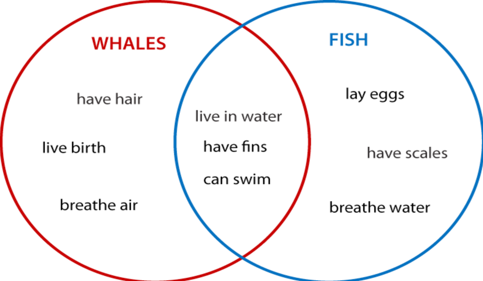
Sample Speaking: The image is a Venn diagram comparing whales and fish. The whale circle highlights characteristics like having hair, giving live birth, and breathing air. The fish circle includes laying eggs, having scales, and breathing water. The overlapping section shows similarities between whales and fish, such as living in water, having fins, and swimming. Whales are mammals, while fish are aquatic vertebrates. The diagram emphasizes both their unique traits and shared aquatic adaptations.
Describe image Question 53
Requires active subscription!
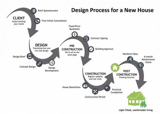
Sample Speaking: This image outlines the design process for building a new house in five stages. It begins with the “Client” stage, where needs are understood through a questionnaire and consultation. Next is the “Design” phase, involving a design brief, concept design, and development. The “Pre-Construction” stage includes a fixed quotation, contract signing, and building approval. The “Construction” phase focuses on house demolition, site updates, and construction work. Finally, the “Post-Construction” phase covers finishing touches, key handover, and a six-month maintenance check, resulting in a comfortable living space.
Describe image Question 54
Requires active subscription!
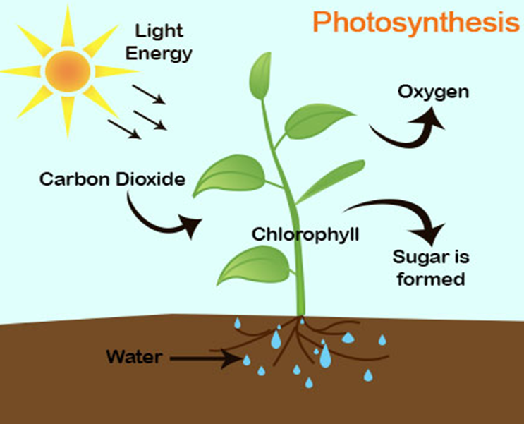
Sample Speaking: This image illustrates the process of photosynthesis in plants. The sun provides light energy, which is absorbed by chlorophyll in the leaves. Plants take in carbon dioxide from the air and water from the soil. These inputs are used to produce sugar, which serves as food for the plant. During this process, oxygen is released into the air as a byproduct. The diagram highlights the essential components of photosynthesis: sunlight, water, carbon dioxide, chlorophyll, sugar production, and oxygen release.
Describe image Question 55
Requires active subscription!
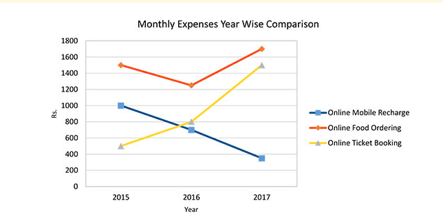
Sample Speaking: This line graph illustrates the year-wise comparison of monthly expenses on three activities: online mobile recharge, online food ordering, and online ticket booking, from 2015 to 2017. Expenses for online mobile recharge (blue line) decreased steadily from approximately 1000 Rs in 2015 to 400 Rs in 2017. Online food ordering (red line) showed a slight dip in 2016 but increased from 1600 Rs in 2015 to over 1700 Rs in 2017. Online ticket booking (yellow line) steadily rose from around 400 Rs in 2015 to nearly 1400 Rs in 2017. The graph highlights changing consumer spending patterns across these categories.
Describe image Question 56
Requires active subscription!
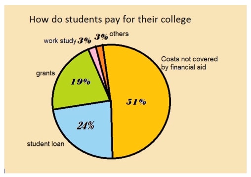
Sample Speaking: This pie chart depicts how students pay for their college expenses. The largest portion, 51%, represents costs not covered by financial aid. Student loans account for 24% of the expenses, while 19% is covered through grants. Work-study programs contribute 3%, and another 3% falls into the “others” category. The chart highlights the significant reliance on self-funding and loans, with a smaller proportion of assistance coming from grants and work-study programs. It provides insight into the financial challenges faced by students.
Describe image Question 57
Requires active subscription!
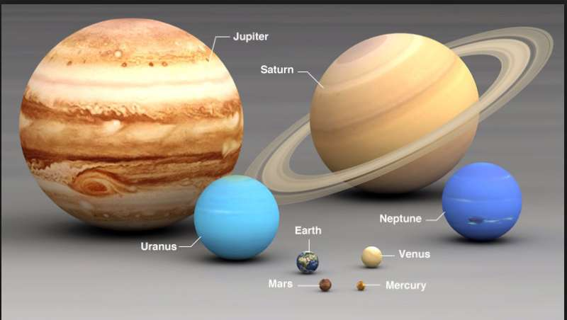
Sample Speaking: This image shows a size comparison of the planets in our solar system. Jupiter, the largest planet, is followed by Saturn, which is distinguished by its prominent rings. Uranus and Neptune are slightly smaller but still significantly larger than the terrestrial planets. Earth, Venus, Mars, and Mercury are much smaller, with Mercury being the smallest. The image highlights the vast size differences between the gas giants and the rocky planets, emphasizing the diversity of planetary characteristics within the solar system.
Describe image Question 58
Requires active subscription!
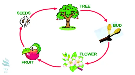
Sample Speaking: This image illustrates the life cycle of a tree in a sequential process. It begins with seeds, which grow into a tree over time. The tree develops buds, which then bloom into flowers. These flowers eventually transform into fruits. The fruits contain seeds, completing the cycle as new seeds fall to the ground and sprout. The diagram emphasizes the continuous and interconnected stages of a tree’s growth and reproduction.
Describe image Question 59

Requires active subscription!
Sample Speaking: The image displays a line graph titled “Girl Scout Cookie Sales.” The x-axis represents days of the week, labeled as Monday through Friday, while the y-axis shows the number of cookies sold, ranging from 0 to 60. The data points are connected by a blue line, indicating sales trends. On Monday, sales start at 20 cookies, rising to 40 by Wednesday. A drop occurs on Thursday to 20 cookies, followed by a sharp increase to 60 cookies on Friday. The graph has a gray background with a legend labeled “Series1” on the right. The overall trend shows fluctuating sales during the week.
Describe image Question 60
Requires active subscription!
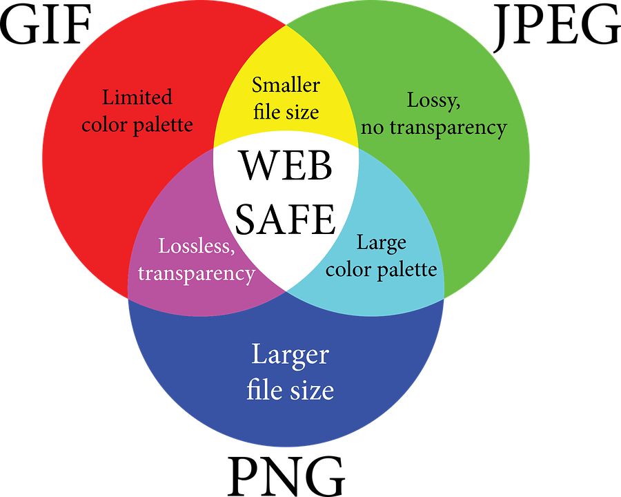
Sample Speaking: The image shows a Venn diagram consisting of three overlapping circles, each representing a specific characteristic of image formats. The red circle indicates a “Limited color palette.” The green circle represents “Lossy, no transparency,” and the blue circle signifies “Larger file size.” The overlapping areas describe combined attributes: “Smaller file size” at the intersection of red and green, “Lossless, transparency” between red and blue, and “Large color palette” where green and blue meet. At the center, where all three circles overlap, the term “WEB SAFE” is written, highlighting compatibility across the attributes. The diagram explains trade-offs in image format properties.
Describe image Question 61

Requires active subscription!
Sample Speaking: The image is a pie chart titled “Energy Consumption in US in 2007,” depicting the percentage contributions of various energy sources. Petroleum accounts for the largest share at 39.24%, followed by Natural Gas at 23.30%, and Coal at 22.44%. Renewable Energy contributes 8.29%, while Nuclear Energy has the smallest share of 6.73%. Each segment is color-coded and labeled for clarity. A legend on the right associates the colors with their respective energy sources. The conclusion is that in 2007, the U.S. primarily relied on non-renewable energy sources, with petroleum, natural gas, and coal constituting over 85% of total consumption. Renewable and nuclear energy made smaller contributions, indicating the need for diversification towards sustainable energy sources.
Describe image Question 62

Requires active subscription!
Sample Speaking: The image illustrates the anatomy of a mature flower, highlighting its main parts. The pistil, the female reproductive structure, includes the stigma, style, ovary, and ovules. The stamen, the male reproductive part, consists of the anther, microsporangium, connective, and filament. Surrounding these are the perianth, which includes the petal (corolla) and sepal (calyx). The floral axis and nectary are also labeled. The diagram is color-coded and well-labeled to depict each component’s structure and function clearly.
Describe image Question 63
Requires active subscription!
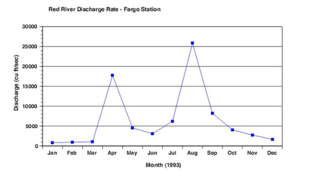
Sample Speaking: The graph represents the “Red River Discharge Rate – Fargo Station” in 1993, showing the monthly discharge rates in cubic feet per second (cu ft/sec). The discharge starts at low levels in January and February, increases sharply in March and peaks in April at around 15,000 cu ft/sec. It then declines through May and June, followed by another significant peak in August at 25,000 cu ft/sec. After August, the discharge rate drops steadily, reaching minimal levels by December. The conclusion is that the Red River experienced two distinct discharge peaks in 1993, one in spring (April) and another in late summer (August), possibly due to seasonal snowmelt and summer rainfall. The trend highlights seasonal variations in river flow influenced by climatic and environmental factors.
Describe image Question 64
Requires active subscription!
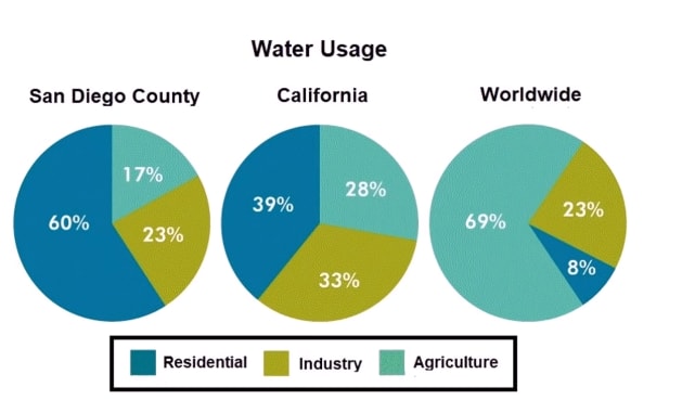
Sample Speaking: The image displays three pie charts comparing water usage across San Diego County, California, and worldwide. In San Diego County, 60% of water is used for residential purposes, 23% for agriculture, and 17% for industry. In California, residential usage accounts for 39%, agriculture for 33%, and industry for 28%. Worldwide, residential water usage is highest at 69%, followed by agriculture at 23%, and industry at 8%. Each chart highlights the varying priorities for water consumption in different regions. The conclusion is that water usage patterns vary significantly. While residential usage dominates worldwide and in San Diego County, California displays a more balanced distribution among residential, agricultural, and industrial uses. This reflects the specific water demands of each area based on geography, population, and economic activities.
Describe image Question 65
Requires active subscription!
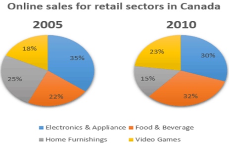
Sample Speaking: The image contains two pie charts comparing online sales across retail sectors in Canada for the years 2005 and 2010. In 2005, Electronics & Appliances held the largest share at 35%, followed by Home Furnishings at 25%, Food & Beverage at 22%, and Video Games at 18%. By 2010, Food & Beverage increased to 32%, while Electronics & Appliances decreased to 30%. Home Furnishings declined to 15%, and Video Games rose to 23%. The conclusion is that online sales patterns shifted over five years, with Food & Beverage and Video Games gaining popularity, whereas Electronics & Appliances and Home Furnishings saw a decrease. This reflects changing consumer preferences in Canada during this period.
Describe image Question 66
Requires active subscription!
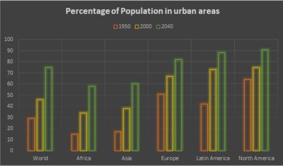
Sample Speaking: The image depicts a bar graph comparing the percentage of the population living in urban areas globally and across six regions: World, Africa, Asia, Europe, Latin America, and North America, for the years 1950, 2000, and 2040. In 1950, urban populations were relatively low, especially in Africa and Asia. By 2000, all regions showed an increase, with Latin America and North America reaching nearly 75%. The projections for 2040 suggest further urbanization, particularly in Europe, Latin America, and North America, where urban populations are expected to exceed 80%. The conclusion is that urbanization trends are intensifying worldwide, with significant growth in Africa and Asia by 2040. Urban living will dominate globally, emphasizing the need for sustainable urban planning.
Describe image Question 67

Requires active subscription!
Sample Speaking: The line graph illustrates the natural increase in Australia’s population, represented by a rolling annual figure, between 1984 and 2012. The data shows fluctuations around the average line of 130,000 births per year. Initially, the natural increase hovered near the average, followed by a decline in the late 1990s. However, from the early 2000s, the trend experienced a steep rise, peaking at approximately 160,000 in 2008, before slightly decreasing toward the end of the period. The conclusion is that Australia’s population growth, driven by natural increase, has experienced significant variations over the years, with a notable surge in the early 2000s, possibly due to favorable economic or demographic factors.
Describe image Question 68
Requires active subscription!
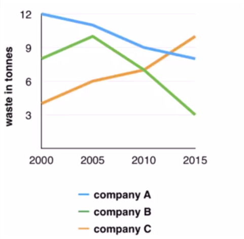
Sample Speaking: The line graph compares the waste output of three companies (A, B, and C) from 2000 to 2015 in tonnes. Company A showed a steady decline in waste production, starting at 12 tonnes in 2000 and dropping to 8 tonnes in 2015. Company B initially increased its waste from 8 tonnes in 2000 to a peak of 10 tonnes in 2005, followed by a significant decline to 3 tonnes by 2015. Conversely, Company C’s waste output rose consistently, beginning at 4 tonnes in 2000 and reaching 10 tonnes by 2015. In conclusion, the graph highlights different trends in waste management among the companies, with Company A and B reducing waste significantly, while Company C experienced an increase over the same period.
Describe image Question 69
Requires active subscription!
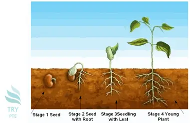
Sample Speaking: The image illustrates the growth stages of a plant, starting from a seed to a young plant. In Stage 1, the seed is planted in the soil. In Stage 2, the seed develops roots, signifying the initial step toward growth. Stage 3 shows the emergence of a seedling with a small leaf, marking further development. Finally, in Stage 4, the seedling grows into a young plant with multiple leaves and a well-developed root system. In conclusion, the image highlights the sequential process of plant growth, emphasizing the transformation from a seed to a young plant, showcasing the essential stages of development in nature.
Describe image Question 70

Requires active subscription!
Sample Speaking: The image is a flowchart illustrating the process of becoming a medical doctor. It begins with completing a bachelor’s degree, typically taking four years. After that, one must attend medical school for another four years. The next step involves completing an internship program at a hospital, which takes 3–7 years. If the individual wishes to specialize, they must undertake a fellowship lasting 1–3 years. Afterward, they must pass the licensing exams. Once these requirements are fulfilled, they can receive a medical license to practice medicine. In conclusion, the flowchart clearly outlines the sequential steps to becoming a qualified medical doctor, emphasizing the rigorous and extensive education and training involved.
Describe image Question 71

Requires active subscription!
Sample Speaking: The line chart depicts the wildlife population of bears, dolphins, and whales from 2011 to 2016, measured in thousands. The population of bears showed a steady increase, starting at 50,000 in 2011 and reaching nearly 200,000 by 2016. In contrast, the dolphin population declined from 150,000 in 2011 to around 50,000 in 2016. The whale population remained relatively stable, fluctuating between 75,000 and 100,000 throughout the years. In conclusion, the chart highlights significant growth in the bear population, a sharp decline in dolphins, and stable trends for whales, reflecting varying population dynamics among these species over the six-year period.
Describe image Question 72

Requires active subscription!
Sample Speaking: The image is a horizontal bar chart titled “Extended Customer Satisfaction Survey by Bank – Narrow Bars”. It compares the satisfaction percentages of six banks: Morgan Stanley, Goldman Sachs, Citibank, Wells Fargo, Bank of America, and JP Morgan Chase. Each bank is represented by a uniquely colored bar. The x-axis shows the satisfaction percentage, ranging from 0 to 80. JP Morgan Chase has the highest satisfaction percentage, while other banks, such as Morgan Stanley and Goldman Sachs, show slightly lower levels. The data indicates variation in customer satisfaction among these banks. The chart emphasizes customer preferences and the competitive landscape in the banking sector.
Describe image Question 73

Requires active subscription!
Sample Speaking: The image illustrates the Deepwater Horizon oil spill containment process. It shows the flow of oil from the breached riser at the ocean floor to containment systems. The Discoverer Enterprise vessel collects oil through a riser pipe on the left, while the Q4000 vessel handles mud injection via a riser on the right. An underwater vehicle is tethered near the blowout preventer to monitor and manage operations. Oil leaks from multiple points, including the riser and choke pipe, are visible. A manifold and flexible hose are also part of the containment system, directing flow and managing pressure.
Describe image Question 74

Requires active subscription!
Sample Speaking: The image is a pie chart titled “Global Language Distribution by Number of Speakers.” It displays the percentage of global speakers for various languages. The largest segment, labeled “Other,” accounts for 30% of speakers, representing all less commonly spoken languages. Mandarin is the second largest at 19%, followed by English at 17%. Hindi makes up 13%, while Spanish accounts for 8%. French and Arabic have smaller shares, contributing 7% and 6% respectively. The chart visually emphasizes the diversity of global language distribution, with “Other” comprising nearly one-third of all speakers worldwide.
Describe image Question 75
Requires active subscription!
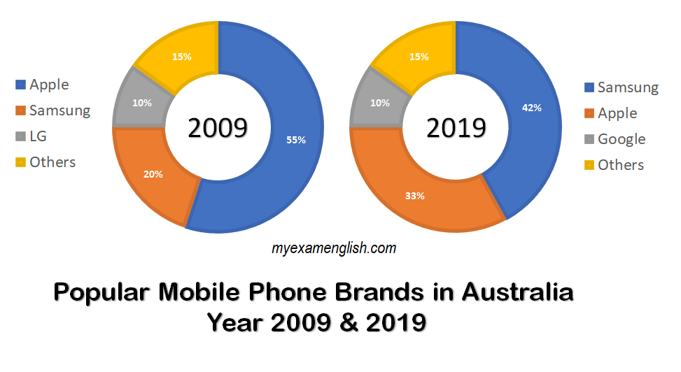
Sample Speaking: The image compares popular mobile phone brands in Australia for the years 2009 and 2019 using two pie charts. In 2009, Apple dominated with 55% market share, followed by Samsung at 20%, LG at 10%, and Others at 15%. By 2019, the market shifted significantly: Samsung became the leader with 42%, while Apple dropped to 33%. Google replaced LG with a steady 10% share, and Others remained unchanged at 15%. The charts highlight a notable shift in brand preferences over the decade, with Samsung gaining prominence and Apple losing its leading position.
Describe image Question 76

Requires active subscription!
Sample Speaking: The line graph compares the monthly rainfall (mm) in two major cities, London and Berlin, throughout the year. London is represented by a blue line, while Berlin is shown with a yellow line. Rainfall fluctuates in both cities, with London experiencing relatively consistent levels throughout the year, typically ranging between 40-60 mm. In contrast, Berlin shows more variation, with a peak in June (70 mm) and a significant drop in February (below 40 mm). Both cities exhibit increases and decreases at different times, highlighting distinct rainfall patterns between them.
Describe image Question 77

Requires active subscription!
Sample Speaking: The image illustrates The Water Cycle (Hydrologic Cycle), depicting the continuous movement of water through various stages. Key processes include evaporation from water bodies and transpiration from trees, both contributing to water vapor in the atmosphere. This vapor cools and forms clouds through condensation. The clouds release water as precipitation (rain or snow), which flows as surface runoff and subsurface (underground) runoff into water bodies, completing the cycle. The process of accumulation in lakes and oceans serves as a reservoir for evaporation. The diagram emphasizes the interconnected stages of water movement in nature.
Describe image Question 78
Requires active subscription!
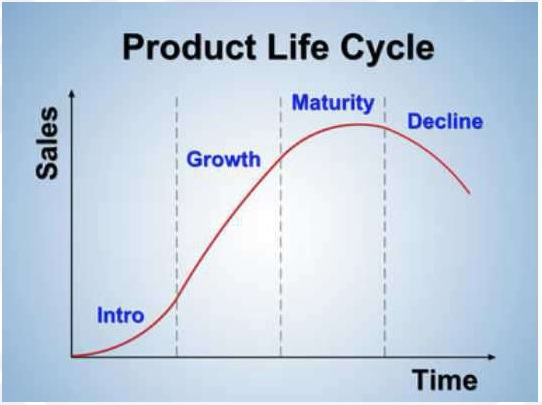
Sample Speaking: The image illustrates the Product Life Cycle, a graphical representation of a product’s sales performance over time. It consists of four stages: Introduction, where sales are low as the product is launched; Growth, characterized by a rapid increase in sales; Maturity, where sales peak and stabilize; and Decline, marked by a reduction in sales due to market saturation or competition. The curve highlights how sales evolve over time, emphasizing the importance of strategic planning at each phase to maximize the product’s profitability.
Describe image Question 79

Requires active subscription!
Sample Speaking: The image illustrates the composition of gases in the air using vertical bar charts. Nitrogen is the most abundant gas, making up 78% of the atmosphere, represented by a tall green bar. Oxygen, shown with a red bar, accounts for 21% of the air. Water vapor has a low and unspecified percentage, depicted by a blue bar. Lastly, carbon dioxide, represented by a grey bar, constitutes only 0.04% of the air. The chart effectively demonstrates the dominance of nitrogen and oxygen in Earth’s atmosphere, while other gases are present in trace amounts.
Describe image Question 80

Requires active subscription!
Sample Speaking: The bar graph shows the import of gold bars in the United States from 2007 to 2011, measured in millions of dollars. The data indicates a consistent increase over four years. In 2007-2008, the import value was US $2648 million, which rose to US $4639.38 million in 2008-2009. By 2009-2010, the figure surged to US $7474.43 million, and it peaked at US $8275.63 million in 2010-2011. The chart highlights a substantial growth in gold imports during this period, signifying rising demand or investment in gold.
Describe image Question 81

Requires active subscription!
Sample Speaking: This image illustrates a cartoon-style depiction of a person sitting on a pink beanbag while reading a book. The background features a bright blue circle, highlighting the central character. The individual is dressed in a black shirt and mustard-yellow pants, paired with casual black sneakers. Two speech bubbles with ellipses float above, symbolizing thoughts or dialogue. The illustration employs soft, vibrant colors, creating a cheerful and inviting atmosphere. The person appears relaxed, emphasizing the pleasure of reading in a comfortable setting. The minimalistic design adds to the simplicity and focus of the scene. Overall, the image conveys a sense of calm, leisure, and intellectual engagement.
Describe image Question 82
Requires active subscription!
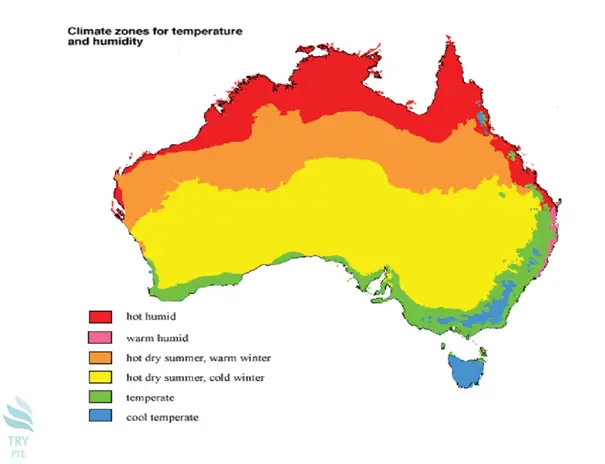
Sample Speaking: This image depicts a map of Australia, showcasing various climate zones based on temperature and humidity. The map uses a gradient of colors to represent different climates. Red areas indicate “hot humid” zones, primarily in the northern regions. Orange represents “warm humid,” while yellow indicates “hot dry summer, warm winter.” Light green signifies “hot dry summer, cold winter,” and darker green represents “temperate” zones, located in the southern regions. Finally, blue areas in the southeast and Tasmania denote “cool temperate” climates. The map provides a clear visual distribution of Australia’s diverse climates, reflecting the variations across the continent.
Describe image Question 83

Requires active subscription!
Sample Speaking: This image depicts a triangular diagram titled “Formula for Better Health.” The triangle is divided into three sections, each representing a key element of a healthy lifestyle. The top portion is labeled “Diet” and is shaded in orange, emphasizing the importance of proper nutrition. The bottom left section, in blue, is labeled “Workout,” highlighting the role of physical activity. The bottom right section, in green, is titled “Healthy Lifestyle,” reflecting the integration of habits for overall well-being. At the center of the triangle is “Balance,” symbolizing the need to harmonize these components for optimal health. The layout visually conveys the interdependence of these factors.
Describe image Question 84

Requires active subscription!
Sample Speaking: This image illustrates a flowchart titled “Beginning of Flow Chart for Quiz.” It starts with “Slide 1” where the user is prompted to click to start the quiz. It flows to “Slide 2,” which presents Question 1. From there, two options are available: “Click False” leading to “Slide 3,” indicating a correct answer with a prompt to proceed to the next question, and “Click True” leading to “Slide 4,” which shows an incorrect answer with instructions to move forward. Both paths ultimately lead to “Slide 5,” where Question 2 is presented. The diagram effectively outlines the decision-making process in a quiz format.
Describe image Question 85

Requires active subscription!
Sample Speaking: This bar chart shows the “Proportion of trips made by mode, Sydney, 2004.” The vertical axis represents the percentage, while the horizontal axis categorizes the modes of transport. Vehicles dominate with 72% of the trips. Train, bus, and ferry follow, accounting for 10%. Walking comprises 17%, showing a significant portion of trips made by foot. Other modes contribute minimally, making up only 2%. The chart highlights the overwhelming preference for vehicles in Sydney, with walking as the second most popular mode and public transport taking a smaller share.
Describe image Question 86

Requires active subscription!
Sample Speaking: This bar chart displays the “Ice Cream Sold (Scoops)” across five months: May, June, July, August, and September. The vertical axis represents the number of scoops sold, while the horizontal axis lists the months. The sales start at around 50 scoops in May and increase significantly to 150 in June. July records the highest sales, with approximately 350 scoops. August sees a decline to 250 scoops, followed by a sharp drop in September, where sales return to 50 scoops. The data suggests peak ice cream consumption during the summer months, especially in July.
Describe image Question 87
Requires active subscription!
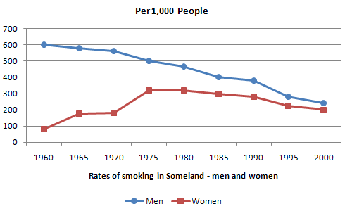
Sample Speaking: The graph shows the smoking rates per 1,000 people for men and women in Someland from 1960 to 2000. Men’s smoking rates: The number of male smokers started at 600 per 1,000 in 1960, gradually declining throughout the period to around 250 by 2000. Women’s smoking rates: The number of female smokers began much lower at approximately 100 per 1,000 in 1960, rose steadily to 300 by 1975, and then remained relatively stable before declining slightly to around 200 by 2000. This demonstrates a consistent decline in smoking rates for men, while women’s rates initially increased before leveling off and decreasing slightly.
Describe image Question 88
Requires active subscription!
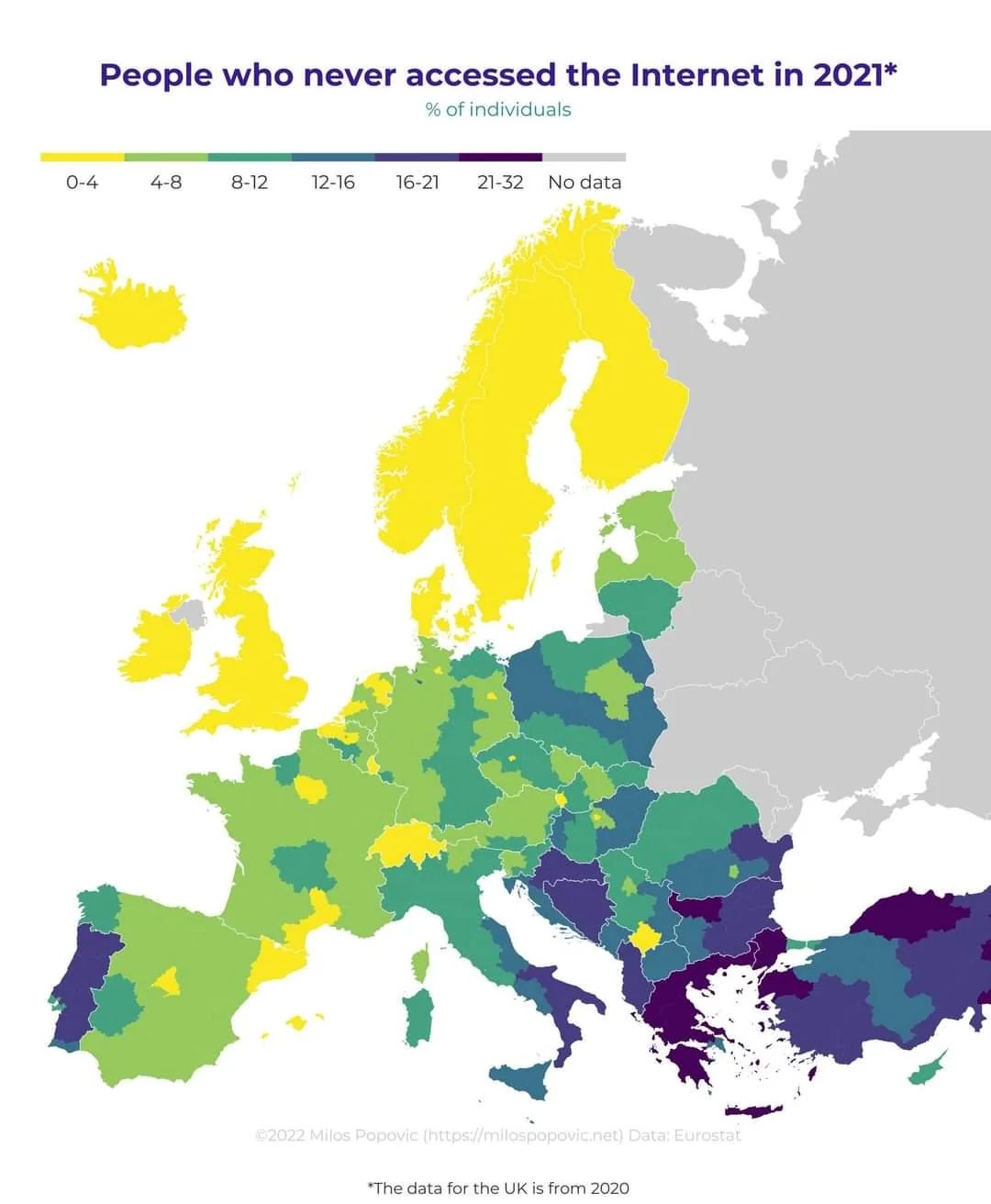
Sample Speaking: This map illustrates the percentage of individuals who never accessed the internet in 2021 across Europe, based on data from Eurostat. The UK data is from 2020. Colors indicate the percentage of non-internet users: yellow regions (0-4%), light green (4-8%), green (8-12%), dark green (12-16%), teal (16-21%), and purple (21-32%). Countries like Norway, Switzerland, and the Netherlands show the lowest percentages, while higher non-usage rates appear in parts of Eastern Europe and the Balkans. Several countries lack data, depicted in gray.
Describe image Question 89
Requires active subscription!
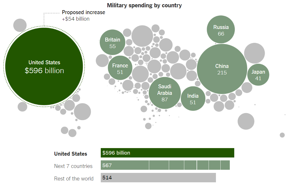
Sample Speaking: This infographic details military spending by various countries, using different-sized circles to visually represent each country’s military expenditure. The United States leads with $596 billion, significantly more than any other nation, and is considering a proposed increase of $54 billion. The next seven countries combined (including China with $215 billion, Saudi Arabia with $87 billion, Russia with $66 billion, Britain with $55 billion, India and France each with $51 billion, and Japan with $41 billion) spend $567 billion, nearly matching the U.S. total. All other countries combined spend $514 billion.
Describe image Question 90
Requires active subscription!
Sample Speaking: This infographic details military spending by various countries, using different-sized circles to visually represent each country’s military expenditure. The United States leads with $596 billion, significantly more than any other nation, and is considering a proposed increase of $54 billion. The next seven countries combined (including China with $215 billion, Saudi Arabia with $87 billion, Russia with $66 billion, Britain with $55 billion, India and France each with $51 billion, and Japan with $41 billion) spend $567 billion, nearly matching the U.S. total. All other countries combined spend $514 billion.
Describe image Question 91
Requires active subscription!
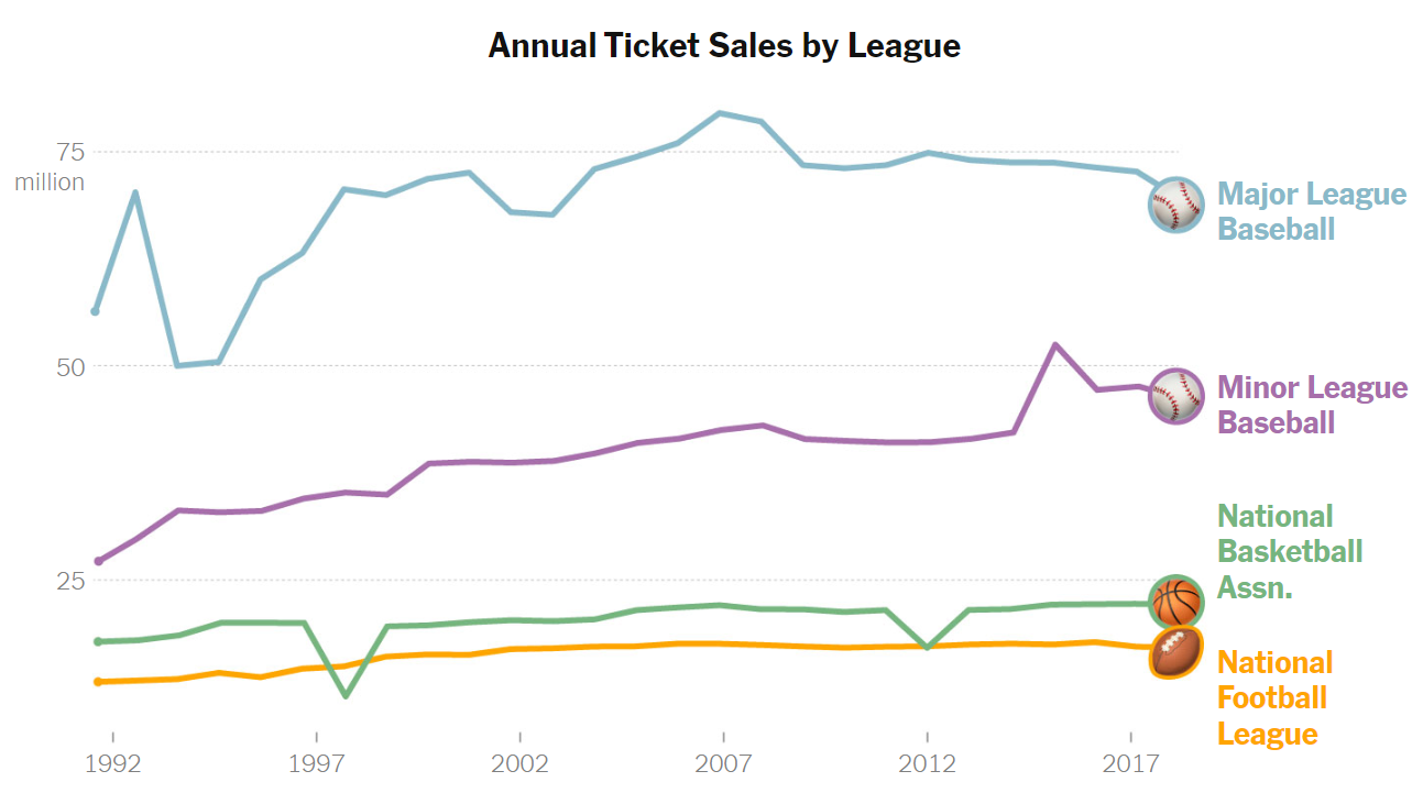
Sample Speaking: The graph displays annual ticket sales for major sports leagues from 1992 to around 2017. The data provides a comparative overview of the popularity and audience engagement of these leagues. Major League Baseball leads with the highest sales, peaking just below 80 million tickets. Minor League Baseball follows a steady trend around 40 million, until a recent, yet brief, spike around 2014. The National Basketball Association and the National Football League (NFL) show more modest, stable sales figures, both generally maintaining between 15 to 25 million tickets sold annually.
Describe image Question 92
Requires active subscription!
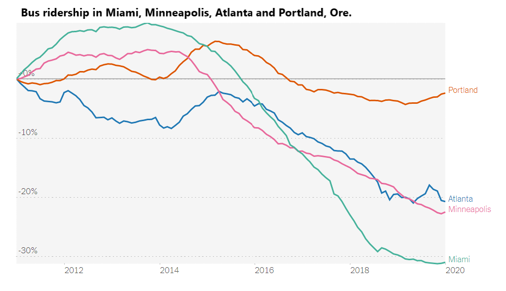
Sample Speaking: The graph depicts trends in bus ridership changes from approximately 2011 to 2020 in Miami, Minneapolis, Atlanta, and Portland, Oregon. Miami shows a dramatic decrease in ridership, dropping by more than 30%. Minneapolis and Atlanta exhibit similar patterns, both with significant declines, though not as severe as Miami’s drop. Portland’s ridership remains relatively stable, experiencing a minor decrease compared to the others. Overall, the graph illustrates a broad decline in bus ridership in these cities, with Portland maintaining the most stable trend over the period.
Describe image Question 93
Requires active subscription!
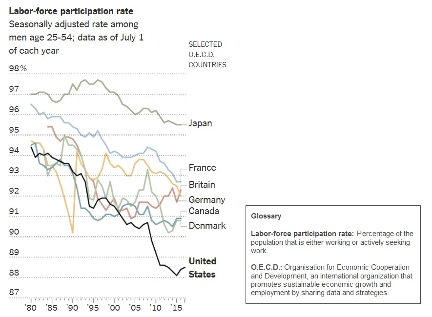
Sample Speaking: The graph displays the labor-force participation rate among men aged 25-54 in selected OECD countries from 1980 to 2017. All countries in the chart show a decline during this period, though the magnitude of the declines varies between countries. Japan maintains the highest rates throughout. Other nations, including France, Britain, Germany, Canada, and Denmark dropped less than 5 percentage points. However, the United States exhibits a more significant decline in participation rates, falling from near 95% in 1980 to approximately 88% by 2015.
Describe image Question 94
Requires active subscription!
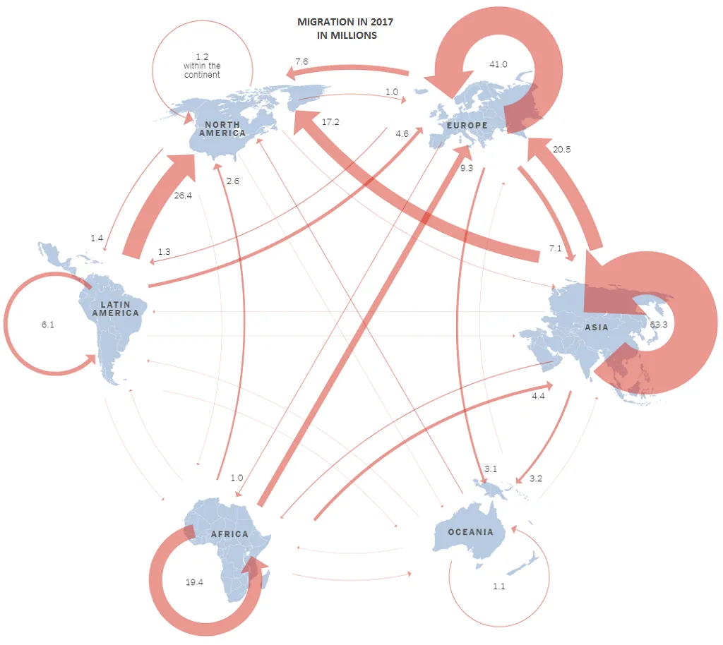
Sample Speaking: This infographic illustrates global migration patterns in 2017, highlighting the movement of millions of people between and within continents. Notable flows include 63.3 million people migrating within Asia, 41 million within Europe, and 26.4 million within North America. There were also significant flows from Latin America to North America (26.4 million) and from Asia to Europe (20.5 million). Generally speaking, there was more migration from regions with more developing countries like Africa, Asia, and Latin America to more developed regions like North America and Europe than vice-versa.
Describe image Question 95
Requires active subscription!
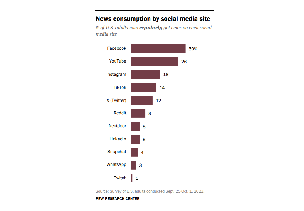
Sample Speaking: This bar chart illustrates the percentage of U.S. adults who regularly get news from various social media sites, based on a survey conducted from September 25 to October 1, 2023. Facebook leads as the most common source with 30% of adults using it for news, followed by YouTube at 26%. Instagram and TikTok are also popular, with 16% and 14% respectively. Lesser-used platforms include X (Twitter) at 12%, Reddit at 8%, and LinkedIn and Nextdoor each at 5%. Snapchat, WhatsApp, and Twitch have even lower percentages.
Describe image Question 96
Requires active subscription!
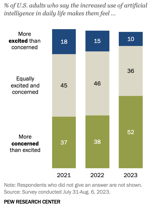
Sample Speaking: This bar chart from the Pew Research Center shows the percentage of U.S. adults’ feelings toward the increased use of artificial intelligence (AI) in daily life, surveyed from 2021 to 2023. In 2021, 18% felt more excited than concerned, decreasing to 10% by 2023. Those equally excited and concerned remained stable at 45% in 2021 and 46% in 2022, then dropped to 36% in 2023. Meanwhile, the proportion more concerned than excited rose from 37% in 2021 to 52% in 2023, indicating growing apprehension about AI among U.S. adults over these years.
Describe image Question 97
Requires active subscription!
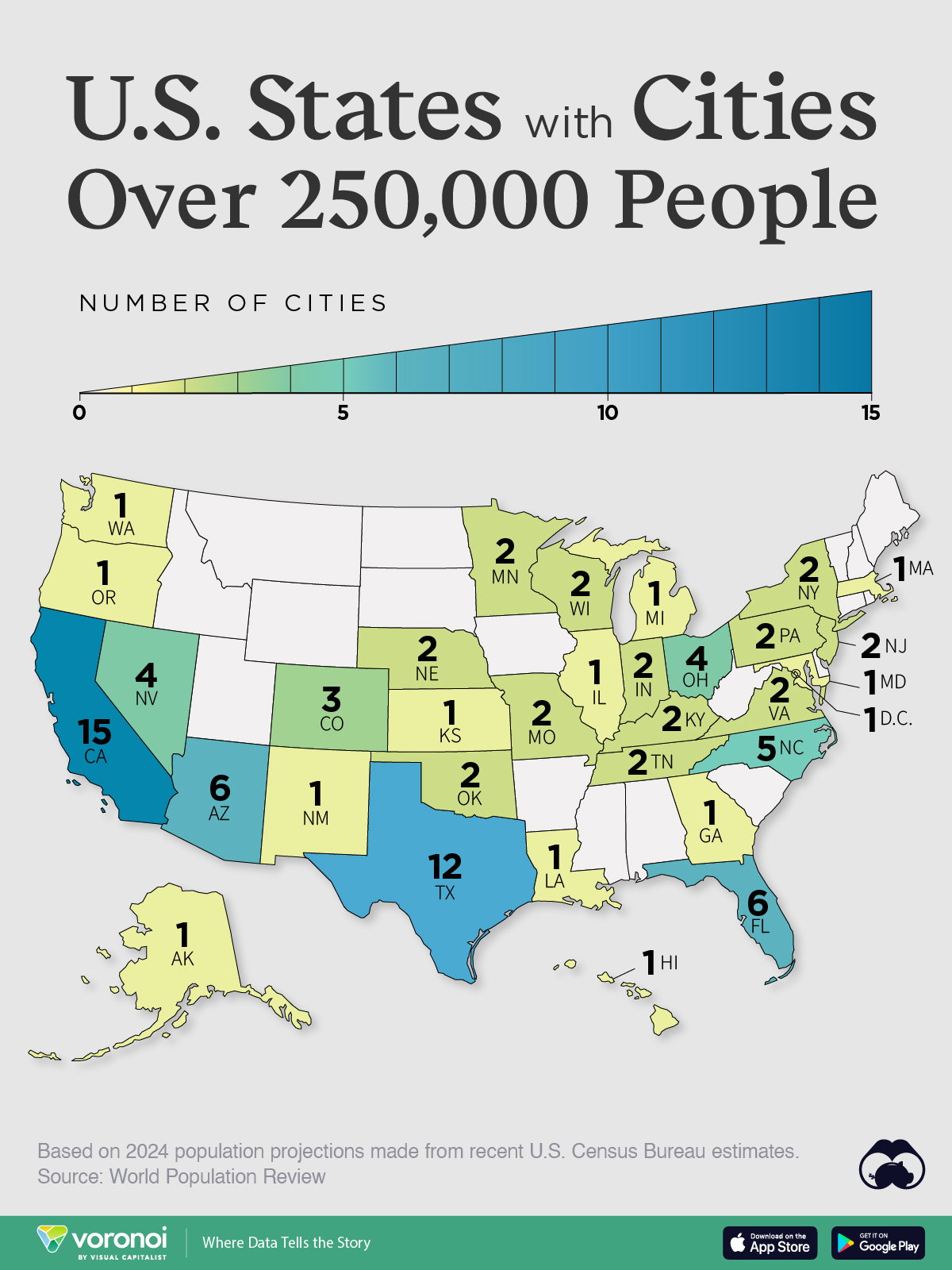
Sample Speaking: This image is a map of the United States, highlighting states that have cities with populations over 250,000 based on 2024 population projections from U.S. Census Bureau estimates. Each state is color-coded and labeled with the number of such cities. California leads with 15 cities, followed by Texas with 12 and Florida with 6. Other states with multiple large cities include Arizona (6), Colorado (3), and North Carolina (5). States like Washington, Oregon, and Alaska each have one city over 250,000.
Describe image Question 98
Requires active subscription!
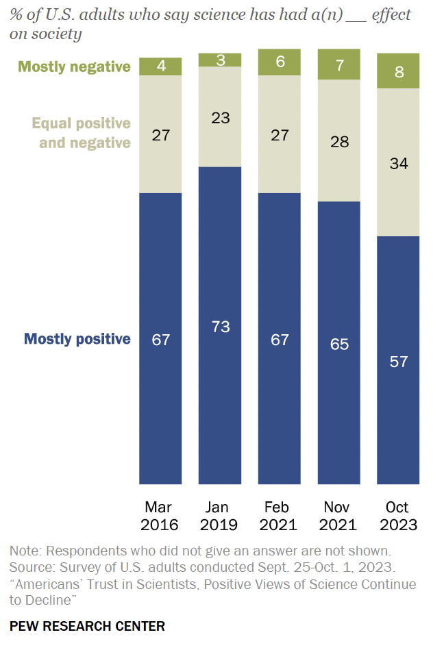
Sample Speaking:This stacked bar chart displays the percentages of U.S. adults who believe science has had a mostly positive, equal positive and negative, or mostly negative effect on society, across five different surveys from March 2016 to October 2023. The proportion of adults viewing science as mostly positive declined from 67% in March 2016 to 57% in October 2023. The percentage seeing science as equally positive and negative increased slightly over the years, while the view of science as mostly negative grew from 4% in 2016 to 8% in 2023. My broad inference from the chart is that respect for science has been on the decline.
Describe image Question 99
Requires active subscription!
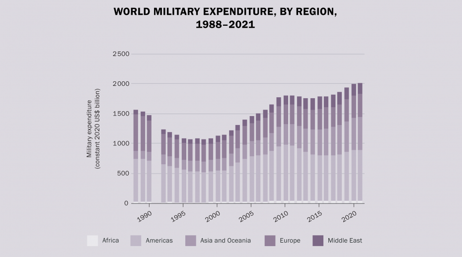
Sample Speaking: The image depicts world military expenditure by region from 1988 to 2021, measured in constant 2020 US dollars. The chart shows expenditure levels for Africa, the Americas, Asia and Oceania, Europe, and the Middle East. Military spending globally started at around $1500 billion in 1988, decreased in the 1990s, and began to rise again in the early 2000s. By 2021, military expenditure had increased to nearly $2000 billion or $2 trillion dollars. The Americas consistently have the highest expenditure, followed by Europe and Asia and Oceania. The Middle East and Africa have relatively lower spending.
Describe image Question 100
Requires active subscription!
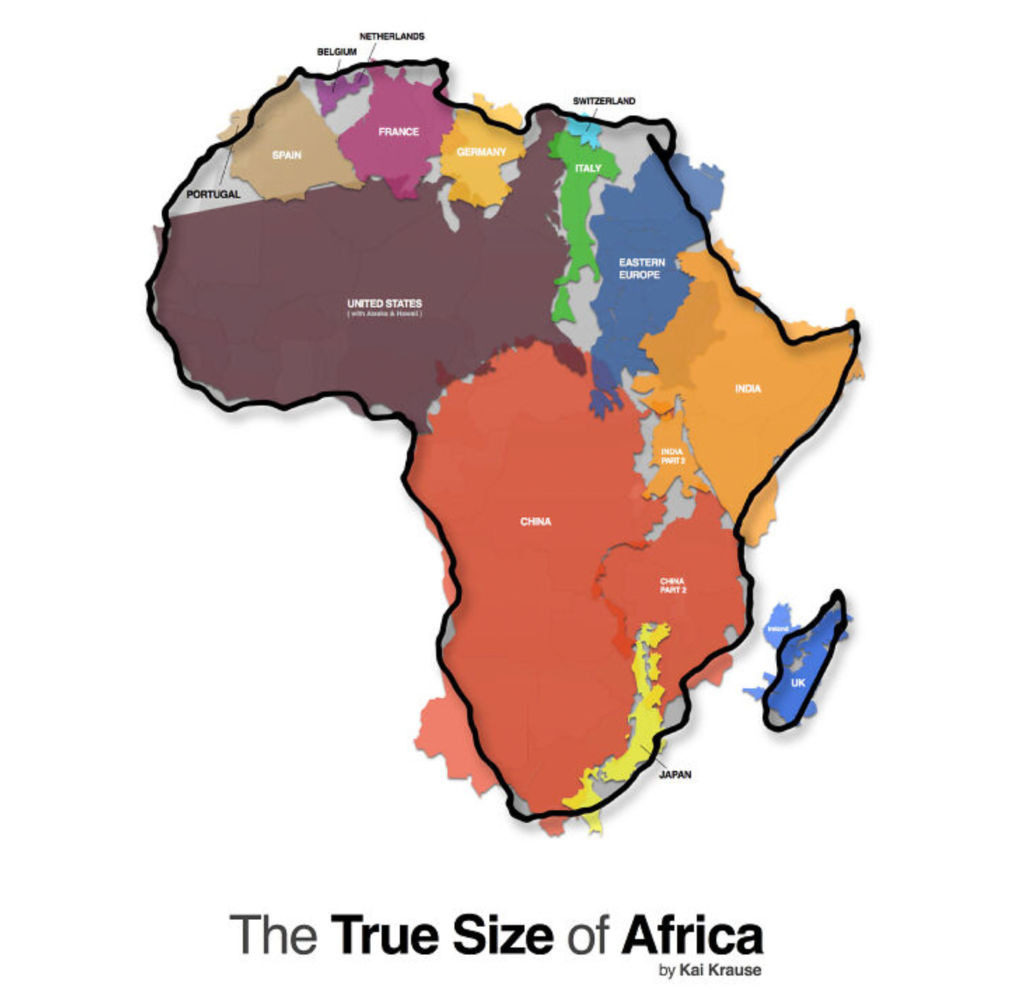
Sample Speaking: This map is titled “The True Size of Africa,” and it demonstrates Africa’s vast geographical area by overlaying various countries within its borders. It shows that Africa can accommodate the United States, China, India, Japan, and most of Europe, including France, Germany, Spain, Portugal, Italy, Switzerland, and the UK. The map highlights the often-misunderstood enormity of Africa compared to other major world regions, challenging common perceptions influenced by map projections that distort the continent’s size.
